InstaDocs:
April 2022 - October 2022
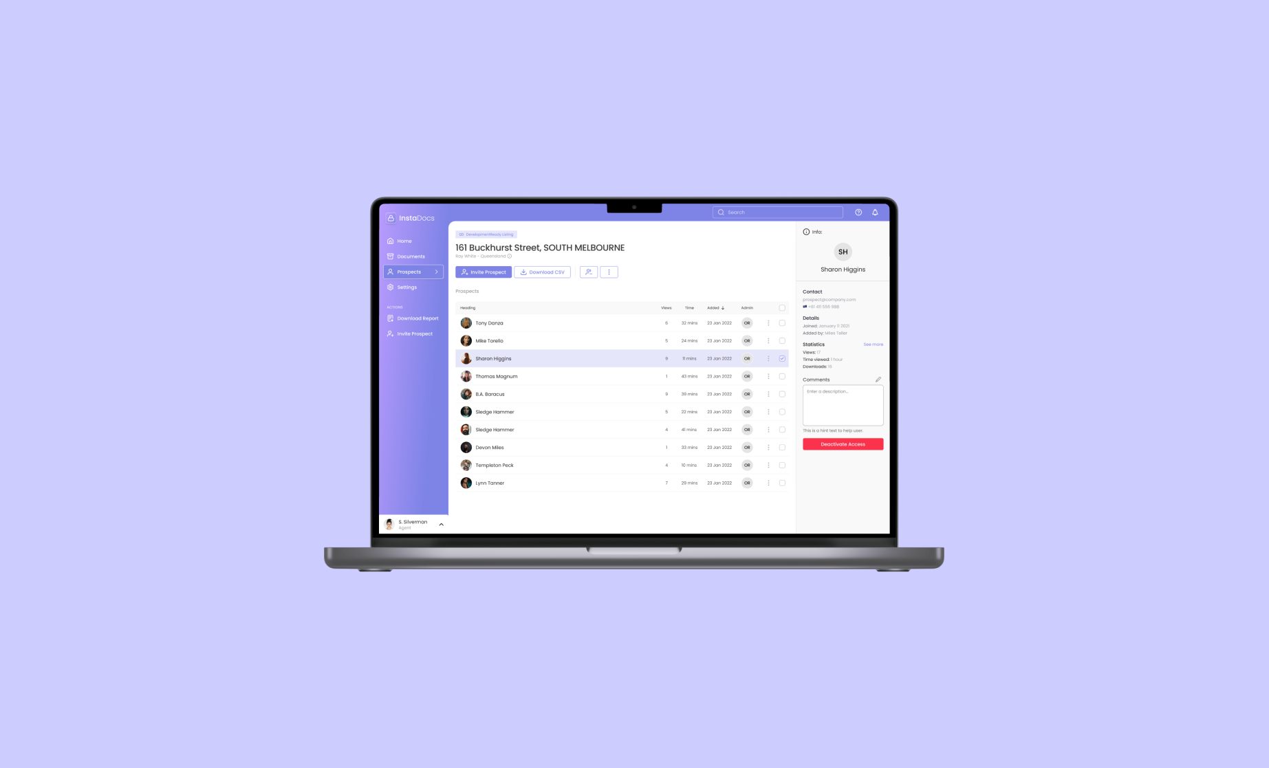
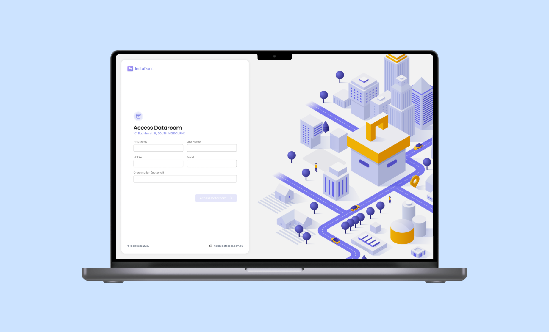
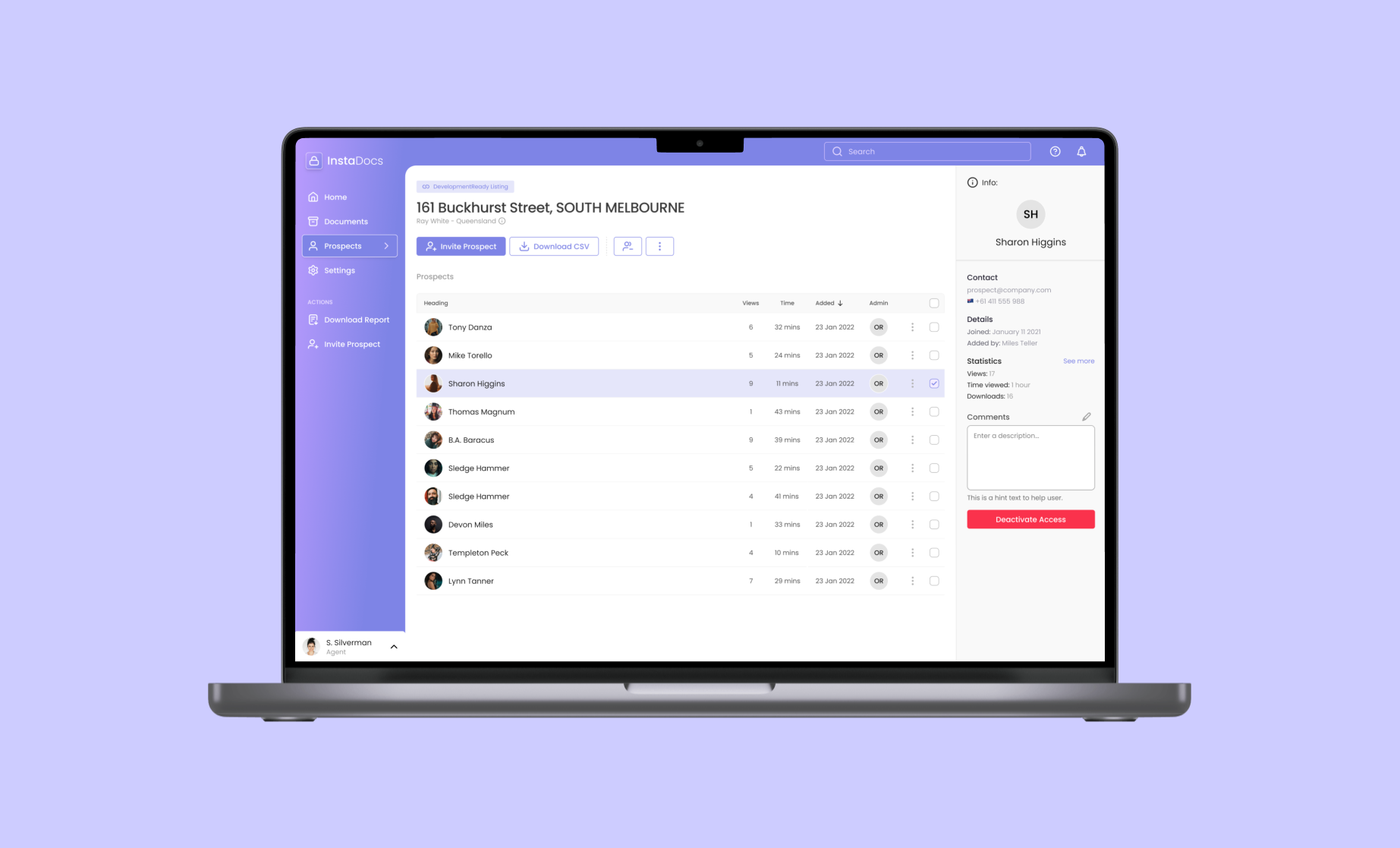
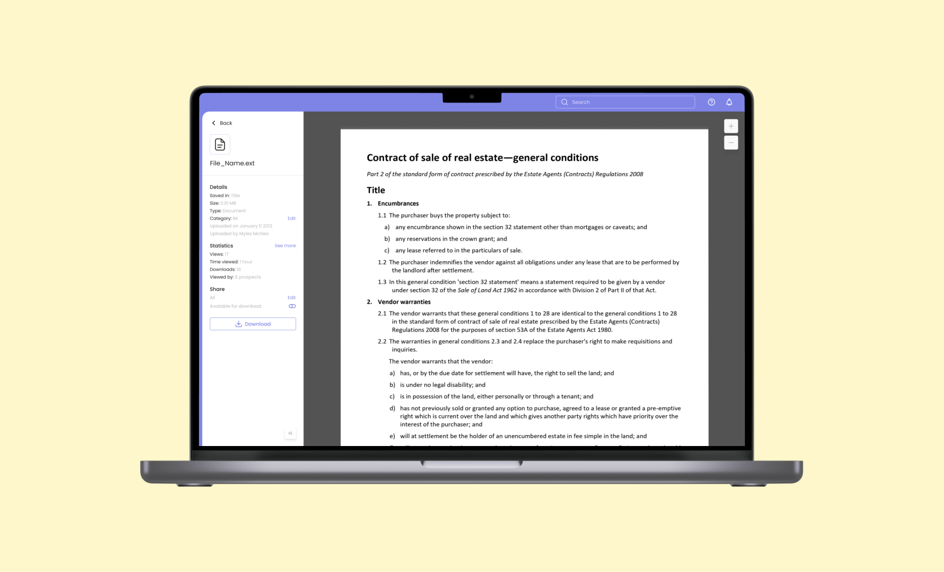
InstaDocs is a document sharing application that allows real estate agencies to gain further insights about their leads by tracking their usage with the relevant documentation.
InstaDocs, Ready Media Group’s document sharing feature, was live and in the market when it rocked up on my work desk. The InstaDocs dataroom was seen internally as a value add on top of a Development Ready (a listing portal for Development properties) listing package.
The business hypothesis was that real estate agencies would be willing to spend more of their marketing budget on one of our listings if we provide them with a way to better analyze their leads.
6 years of InstaDocs.
This project initially came to the team in April of this year. It came with a sense of urgency that led us to partake in the ‘sacrilegious’ UX practice of designing with little to no data.
The result was as one would expect.
There was no alignment within the team on the product itself. We didn’t understand the product or it’s users, and we didn’t know how to improve it.
I ran some user tests on our new designs and it flopped.
We needed data.
We started fresh
My team's task was to better understand the needs and wants of both user groups (agencies and purchasers) with the end goal of improving the product and growing the business.
First, we set out to achieve was to define the problem that InstaDocs was currently solving for the user. We listed our assumptions.
Our internal assumptions about InstaDocs:
-
1.
Real estate agents use the dataroom to share property documentation to potential buyers.
-
2.
Real estate agents want to better understand prospects through granular and detailed insights.
-
3.
There is an appetite from real estate agencies to purchase a dataroom seperate from a listing package.
We put the assumptions to the test
As a team, we reached out to, and interviewed 7 of our clients. These 7 clients varied in their adoption and usage of the InstaDocs feature.
“Our systems are incredibly old, buggy and not user friendly”
“We use OneDrive and Dropbox when not using the dataroom”
“I had to manually change 501 documents to allow prospects to download”
Meet Sarah
Sarah, a marketing manager at a real estate agency, helped guide us through out the design process.
The user interviews gave myself and the team great insight into the needs, motivations and pain-points of the end user. I began to group bits of information from the interviews together in an affinity map to better understand the most common themes.
From these themes I created our user persona, Sarah who would help guide us through our design decisions.
I tested Sarah vs our assumptions
It was important for us to understand what assumptions were validated through our user interviews, and which ones were not.
Sarah DOES want to share property documentation simply and securely.
Sarah DOES care about insights HOWEVER, only the top line statistics.
Sarah DOES see value in a standalone dataroom product, seperate from the listing package.
I needed to nail down the user flows
A snapshot of our user flows, including two sets of users, agencies & prospects. We also considered the current flow against a new flow.
Given that the InstaDocs dataroom was already in the market and being used, it meant we had a platform to start on. All we needed to do was understand whether the current way of doing things, including the user flow, was functioning well, or whether it could do with some enhancements.
From our research, we discovered that there were areas of the user flow that could have been better designed. Agencies were neglecting an entire method of inviting users due to a lack of understanding.
We set out to mould our user flow around better known methods established by known document sharing applications.
It was time to start drawing
The process began with some simple wireframes, and quickly but deliberately developed into high fidelity.
Let the fun begin. This is where myself, and my team got together to put pencil to paper. We started with simple wireframes to establish the core elements that would be shaping the product.
After that, we moved to Figma, where we were able to start putting together medium-fidelity prototypes. This was a fantastic way to test the general structure of the product on internal subjects.
We swiftly moved onto high-fidelity wireframing where we were able to add micro interactions and various states to establish subtle signalling to the user.
Testing the work with real clients
Examples of some of the screen recordings of our Maze testing.
The process did not stop after all our designs were in a neat Figma file. This is where we started to test our designs against real users. This is an incredibly important part of the journey. Here you are able to see what works, what doesn’t and what is missing.
We tested our prototype on 20 generous participants which was made up of both internal and external subjects.
The results
Our final prototype testing score far superseded our tests from the original designs.
We used a service called Maze to test our prototype with clients. Maze provides a usability result at the end of the testing.
The original designs for InstaDocs scored a 55 & 66 respectively.
Our latest designs, which were based on research and data, scored an 86.
Next steps
Iterate… Iterate… Iterate.
The new InstaDocs is about to be pushed to market. It’s now on the design team to observe how the users are interacting with the product. Are the changes working? Are they confusing? Is there a different problem we could be solving?


